When Colour Tricks the Eye: How Human Biology Creates ‘Gear Changes’ in Vision
Nov 29, 2025A Personal Note on Colour
Throughout my interior design practice - and all the years I’ve spent teaching - colour and light have been the subjects that have fascinated me most. Colour, especially, has never felt straightforward. I’ve worked alongside designers who seem to “just know,” people who can build a palette instinctively, the way some musicians play by ear. That wasn’t me.
My own relationship with colour started with a feeling of inadequacy - an awareness that others could see something I couldn’t yet grasp. So I set out on a quest to work out the underlying principles: the patterns, the clues, the mechanics that might explain what gifted colourists do when they compose a scheme, even when they can’t explain it themselves.
Standard colour theory just didn't deliver the insights I wanted, but a story started to emerge when I read about biology, perception and the workings of the eye itself. The more I learned, the clearer it became that colour isn’t just about taste. It’s physiological, psychological and profoundly spatial.
What follows is an introduction to a few ideas that have shaped my approach to colour over the years, and that continue to influence the way I teach designers to understand how colour really behaves in interiors and in the body.
Designers who approach colour from these angles soon realise they’re not just decorating a room. They’re shaping the choreography of how people look, feel and move within it.
The Eye Wasn’t Designed for Interiors: It Was Designed for Survival
Most of us think of colour as something we simply see. But a huge amount happens before anything reaches our conscious perception.
Our eyes are not passive windows. They’re active biological machines, constantly adapting, recalibrating and switching modes - and colour has a remarkable ability to push those systems into gear. The eye doesn’t always show us what’s really there, but the illusions it creates follow predictable rules.
Deep in the retina sit the photoreceptors: cones (for colour and detail) and rods (for motion and low light).
Most of us have three types of cone cell: L (reds-ish), M (greens-ish), and S (blues-ish). Together they give us trichromatic vision. But they don’t all respond at the same speed or intensity. The eye is always trying to balance them, adapt to the light, rest overstimulated receptors and find equilibrium.
So the colours we think we see are never fixed qualities. They’re the result of an ongoing negotiation between light and biology.
The Eye’s Constant Recalibration Creates Wonderful Oddities
A number of well-known perceptual quirks come directly from how the eye works. Designers rarely name them, but they feel their effects every single day.
Here are a few of the most useful.
Successive Contrast: When the Eye Repaints Reality
If you stare at a strong colour (say, a bright red cushion) your L cones tire. Look away, and the fatigued cones (the 'red-calibrated' ones) under-respond. The remaining two sets (green and blue cones that haven't been affected) suddenly dominate, casting a soft turquoise veil over whatever you look at next.
You’re not seeing the world as it is.
You’re seeing the eye trying to correct itself.
This is partly why some colour pairings feel so “electric”. Sensors in the eye are being 'numbed' and 'stimulated' to create an almost physical sensation. Clients may believe they love the energy, but often their visual system is simply in recovery mode.
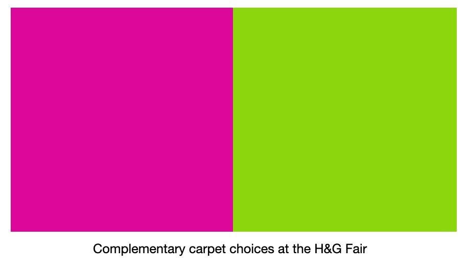 A few years ago at the House & Garden Fair at Olympia, the exhibition floors alternated between hot pink and acid green carpet. Walking from one stretch to the next, especially in strong daylight, felt physically jarring, destabilising, almost like experiencing strong flashing lights at each flooring change. Whoever created the scheme made a terrible (potentially dangerous) mistake - employing successive contrast. It was a powerful reminder of how forcefully colour behaves in the body, and why understanding its mechanics (the kind I explore in my course 3D Colour) is so essential.
Successive contrast lies behind complementary colours, pushing opposing groups of receptors into a rapid on-off flicker. Used well, this creates impact and drama. Used carelessly, it becomes overwhelming and tiring. This is why it's so important to know what you're doing, and not to create effects by accident.
Retinal Fatigue: Itten’s Favourite Trick
My first real introduction to the biology of colour came through Johannes Itten. His exercises deliberately provoke physiological changes, training artists and designers to notice the tiny shifts in perception caused by fatigue and recovery.
Once you become aware of these shifts, you can design rooms that feel lively and vibrant - or calm and quiet - without changing a single piece of furniture.
Itten (1888–1967) - a painter and teacher at the early Bauhaus - believed designers should understand how the eye actually works, not just what colours “mean”. Many of today’s colour principles trace back to the foundations he laid.
If you’d like to explore his work, here’s a free PDF of his book The Art of Colour. It’s short, practical and still one of the clearest introductions to how we perceive colour. If you search, you'll also find his book The Elements of Colour available online. It should be in every colourist's library.
Simultaneous Contrast: When Colours Change Without Changing
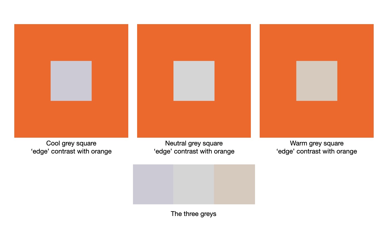 Place two colours side-by-side and each will shift the other’s apparent hue, temperature and saturation. The eye is wired to exaggerate differences at edges - a survival strategy for spotting movement or danger.
Grey on red looks cooler.
Grey on green looks warmer.
Warm colours seem warmer on cool backgrounds, and vice versa. In the image above, the internal edge around the grey squares appears to move from more to less electric as the grey warms up, with the edge around the final (right hand) square less dramatically jarring because both the orange and the grey are warm.
The Purkinje Shift: Why Reds Die at Dusk
As light fades, rods take over from cones. Rods are far more sensitive to blue-green wavelengths.
So at dusk:
• reds lose presence
• blues deepen
• neutrals start behaving unpredictably
• entire rooms change mood
If you’ve ever watched a red-toned room fall flat in the early evening, this is why.
Chromatic Adaptation: Why the Brain Forces “White” to Stay White
Our visual system wants consistency. It tries to believe that white objects are white, whatever the lighting. So it quietly alters our perception to even out colour casts.
This is why a “white” lampshade looks white in cool morning light and in warm evening light - even though, physically, it’s nothing of the sort.
It also means your client may not see the exact colour you’ve painted a wall. They see the brain’s corrected version.
Why We Saw the Dress Differently
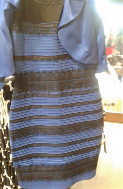
(Writing this blog, I've noticed a strange thing - I see the dress as blue and black in daylight, and white and gold at night, under electric light).
The famous blue/black vs white/gold dress is a perfect case study in how colour is constructed by the viewer's visual system.
Because the lighting in the photo was ambiguous, our brains had to guess:
• Assume shadow → the brain discounts blue light → the dress appears white and gold
• Assume warm light → the brain discounts yellow → the dress appears blue and black
The dress didn’t change. The viewer’s internal white balance did.
Add in tricky luminance and the rod-cone flicker between brightness and colour, and suddenly two people can see completely different things (or the same person can see it differently at different times of the day). It isn't yet known why an individual's eyes default one way or the other, why we don't all see the same thing.
Why This Matters for Designers: We Can Influence the Eye’s Gear Changes
Once you understand that the eye is constantly toggling between:
• contrast detection
• equilibrium-seeking
• fatigue recovery
• low-light mode
…you can design more deliberately.
You can make colours feel richer by priming the eye first - think: a warm corridor leading to a cool room.
You can make neutrals feel more refined by choosing the right neighbours - think: taupe beside muted green instead of stark white.
You can make rooms “bloom” at dusk rather than collapse - think: cooler undertones for evening spaces.
You can create calmer rooms by reducing the number of undertones at play - fewer tasks for the eye = less visual noise. I once worked as Kelly Hoppen's assistant on a colour masterclass, the key exercise she led was to identify the undertone: sand; purple taupe; green taupe. Neutrals are colours too!
Conclusion: Sometimes We’re Not Seeing Colour: We’re Feeling the Body’s Response to It
The eye isn’t a camera. It’s living tissue responding to light, fatigue, wavelength and contrast. Many of the strongest colour effects in a room have nothing to do with pigment at all. They arise from the visual system’s constant efforts to stabilise the world.
This is partly why colour feels emotional.
Not because colour is emotional in itself - but because we are. Our eyes strain, rest, compensate, calm themselves and occasionally fall into slight dissonance. Interiors that respect this dance feel harmonious. Interiors that fight it can feel oddly off, restless or tiring.
This is why fast-food chains use loud, saturated colours: they attract attention, then quickly exhaust the eye, encouraging you not to linger.
3D Colour
If this way of thinking about colour interests you (the biology, the perception, the subtle shifts that change how a room feels) I explore this in my masterclass 3D Colour, an advanced colour course for interior designers.
The course moves far beyond palettes and paint charts. It treats colour as a living system shaped by biology, light and space. You’ll develop the ability to:
• see undertones more accurately
• create palettes more creatively and intentionally
• modify colour to perform exactly as you wish
• choose palettes that feel grounded, calm and beautifully coherent
It’s a practical, intuitive way of working - a designer’s way of seeing that is clearer, calmer and more confident.
If you’d like to understand why colours behave the way they do - and how to use that understanding to create interiors that feel balanced, human and deeply comfortable - you’ll be very welcome inside the course.
Receive my quick-to-read weekly newsletter...
Sign up for the Hothouse Newsletter: find out what's coming up, and keep up with recent webinars, blogposts, videos, and other events - all focused on excellence in interior design practice.
We hate SPAM. We will never sell your information, for any reason.
